Package design
For the maruchan project, I had to create a fusion brand I chose to create Maruchan noodles with Lay’s chip flavoring. The packing design I chose is a red panda eating part of the logo with noodles falling out. Keeping with the barbecue flavor I found a reddish-brown color to match my panda and the flavor of barbecue. I made my red panda using multiple shapes and a pen tool. Making my package simply yet clear to read.
Sketches
Typography
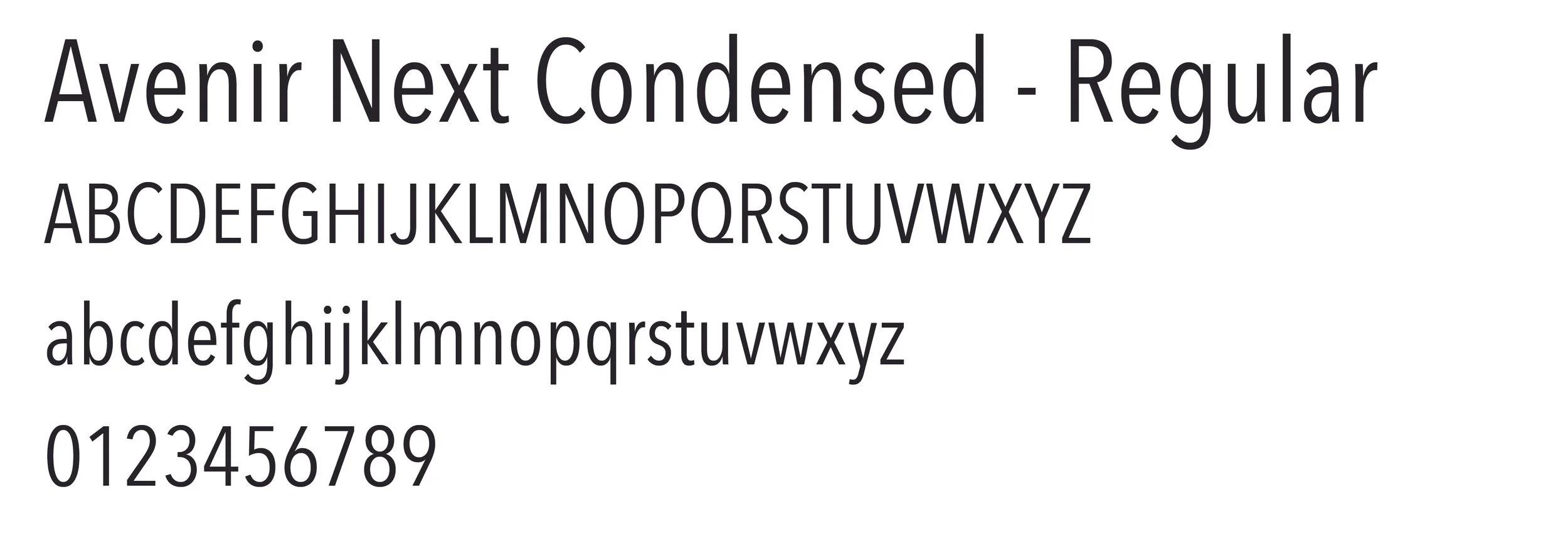
I chose these fonts as they balanced each other out. I used Avenir Next for the front part of the packaging and the DIN Alternate for the back.
Color Palette
I did a variety of different colors. I chose to do red and yellow for the final color product. I kept the red panda the same color. Red and yellow are known in all sorts of food packaging, as it stands out and evokes a certain feeling for people.
Die-lines
This a flatten dieline of my noodle chip bag. The dash lines are where the folds will be. Learning how to create dielines was essential in the process of creating my fushion brand.
Draft 1
I started with dark colors mainly different tones of red. When I did some research black and red were the main colors of a barbecue flavor package. I created the nutrition facts based off of a noodle bag.
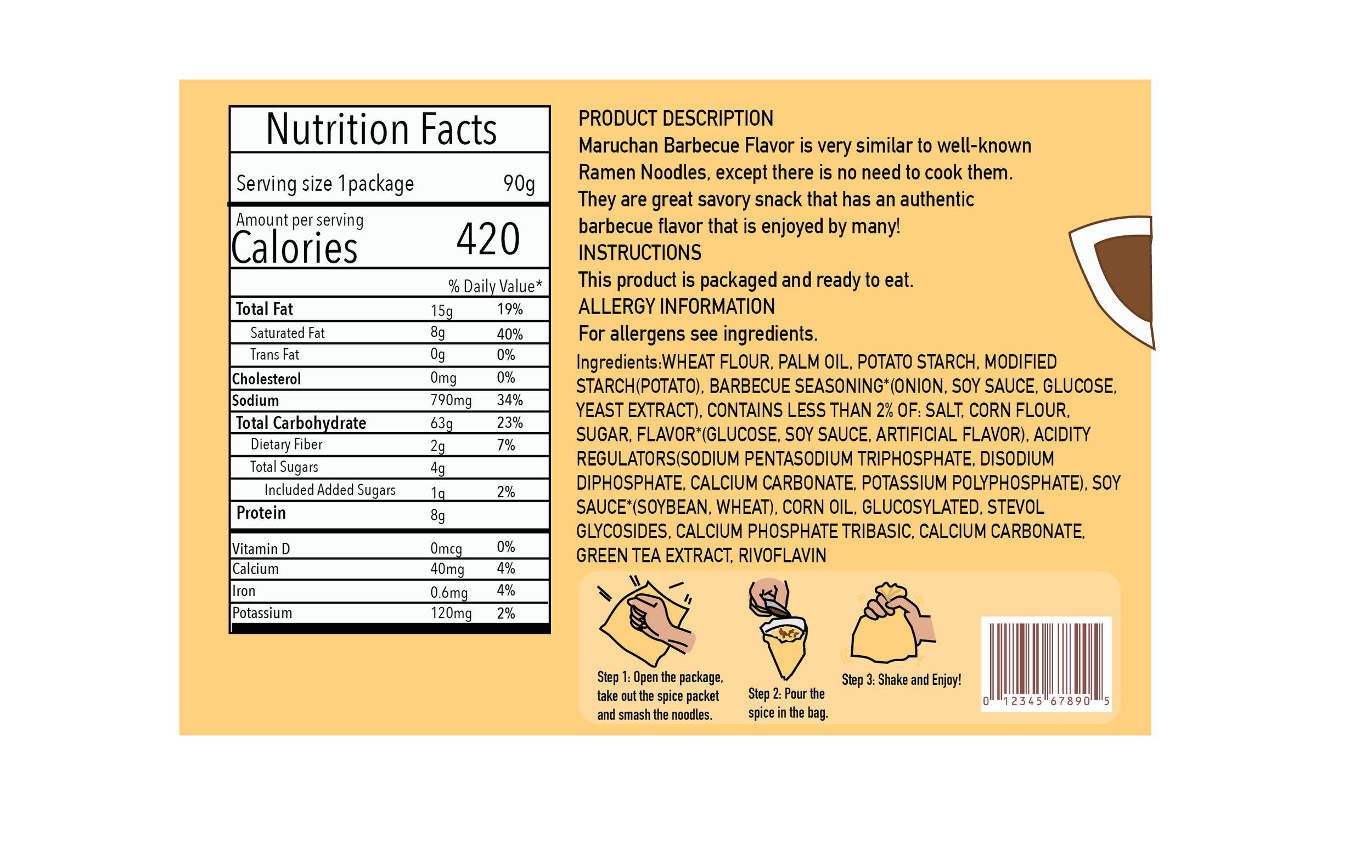
Final
Through my revisions my final, I add red back to the title. To add to the effect of the chip bag, I added the ear to the back of the package.
Environmental Mockup


Draft 2
I changed up the colors and did all yellow tones to contrast with the red panda. I lined up the back of the package that describes what the product is and the ingredients. In doing some more research I add instructions on how to eat it. I made some more revisions to the red panda, making the face a bit nicer.